I missed last night’s crit group. I thought I was coming down with a cold, but I think it was just a whine. And I am very sorry that I did (miss the group, I mean, not miss the cold) because when Jerry Dickason’s photos of the paintings came through today, I really regretted not hearing what others said about them.
So I’m going to post the ones that I like the best from the sets that appeared in this morning’s email.
This is the kind of language that we all use and all beat ourselves upside the head for using: “like” as in, “I really like that.” But so be it — these are ones I liked best. I chose one from each group member (can’t be too greedy) and I make no pretenses that my judgement is sound:
First, Jane Erskine:
 Jane Erskine, 24 x 20″, oil on canvas
I think I instantly liked this one because of the color. Jane’s sense of shape is always excellent, as is her use of color. But in this one, she has changed her palette — or extended it. I feel a sense of landscape — the gray sky with an occluded pale-pink sun, and then those strips of orange-rust and pink that carry one’s eye right down to be stopped by the sunlit “rock” (I have no idea if it’s a rock, but I seem to be into naming). It’s that tremendous rush of movement, stopped, dumbfounded by the color below the muted bits above that attracted me immediately. The bit of black, the shadow, to the left carried me back up to the sun where I was whooshed back to the rock again.
I could say more — the top and right side of the canvas with its playful shape, working off the rock below, for example, perhaps needs further examination. But I must move along.
Here is the piece by David Trowbridge that I chose:
 David Trowbridge, 12 x 9, acrylic on canvas.
I did a double take when I read the size of this canvas. My experience of David’s work is that it’s large, sometimes even massive. I’m having trouble “seeing” his work as this small.
I think I liked this one best of his four because it speaks to a textile piece I’m envisioning in my head, one that I will have to work on soon. I don’t know about other artists, but sometimes I’m drawn to pieces that help me out with a problem of my own; totally self-centered of me, of course.
I like the complex simplicity of this work, the multiple underlayments of color. And again, there’s the vertical line that here, rather than pulling us down, seems to be more serene, to be a still shape rather than a moving spring. The pink diagonal at the bottom moves the eye around but not with the flourish that Jane’s provoked. This is more Zen than spring, methinks. And I like it for its Zen quality, the stillness that surround the large (albeit small) forms.
The last piece (for this post — another post with the other artists is pending) is from Jerry Dickason:
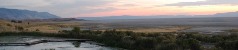
 Jerry Dickason, 7 x 10″, watercolor.
There’s no doubt about why I liked this one: it allows me to breathe, breathe deeply, and watch the wonder of that huge sky with its magnificent clouds. Now I suspect that Jerry said something like “that’s just how it looked” (he often does say this) but I’ve looked at clouds like those, and he’s added emphasis and color — it isn’t “just how it looked” but how it means.
I like the open road in this painting, although its precision makes me think of a photograph, something I’m always a bit skeptical about. But the roadside colors against the black tarmac with the sky and clouds above — all (i.e. a somewhat photographic realism) can be forgiven for the values and color captured here in watercolor. The composition is expected, but the colors and viewpoint exceed all expectations. The triangles, large and small, repeated over the canvas, give it form as well as movement. Like Jane, Jerry has muted color above and a golden glow to the land, a glow our eyes keep moving over.
All three of these painters have painted different from what I’m used to seeing from them, and, darn it, I missed the conversation about what got them here.
I have to confess that I sometimes change my mind about which painting I like the best after hearing the discussions in the group. People point out things I miss, whole elements of movement or rhythms or color that bypass me. So I’m not saying these are the best paintings shown last night. I’m not even saying these are the ones I would have liked best had I been in on the critique last night. However, given the limitations of my brain, vision, the computer, and life, I’m voting (today, after dinner, at 7 PM) for these three.
And three others that will appear in a later post, from Catherine, Helen, Susan and Emery. –June

You are most welcome, David, although I should be thanking you. Jane wrote a funny note that I may have to mention in passing next time. Something about glances across the room and the seduction of art….
LikeLike
thanks for including my picture on your blog, June, and for your insightful comments. looking forward to the next critique.
LikeLike